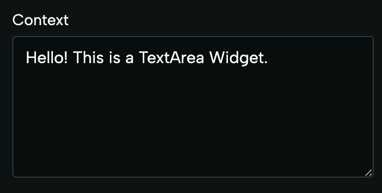
TextArea
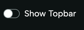
CheckBox
ImageUri
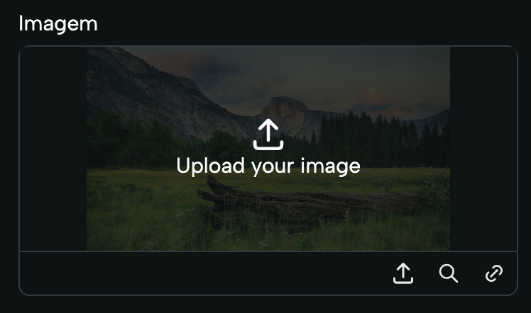
ImageWidget. This type can be
imported from deco-cx/apps. Example:
VideoUri
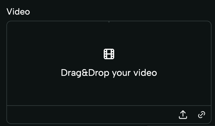
VideoWidget. This type can be
imported from deco-cx/apps. Example:
Section
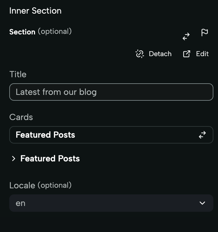
Section widget is used to create Sections that can receive other Sections
as properties. It works similarly to receiving other components via props. When
using this field, you can select any Section from your project. The form
rendered in this widget takes the form of the same form that would be rendered
for the selected Section. This widget is rendered for fields of type Section.
This type can be imported from deco-cx/apps. Example:
Select
HTML
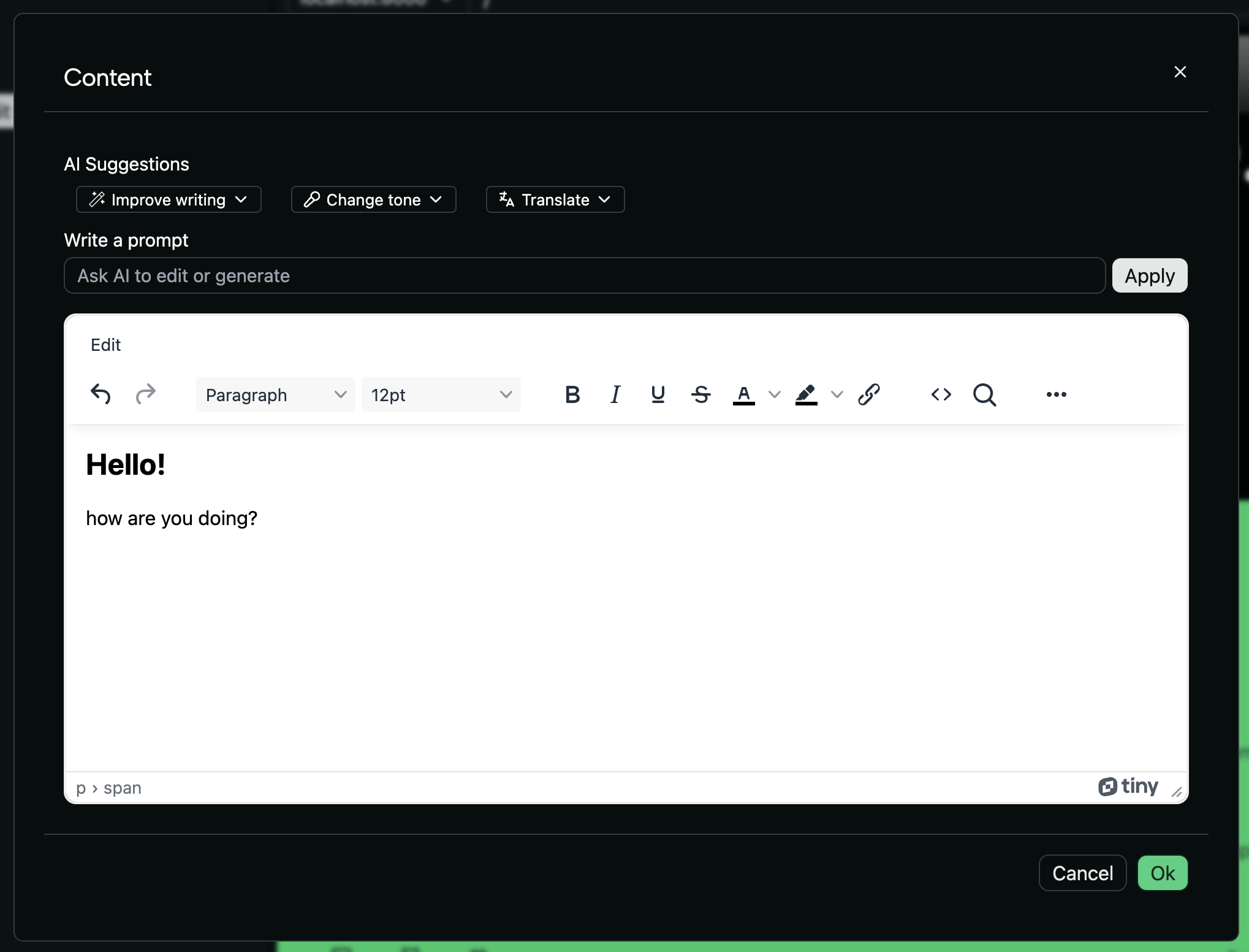
HTMLWidget. This widget allows
editing the content of its field through a
WYSIWYG (What You See Is What You Get)
Editor. This type can be imported from deco-cx/apps. Example:
RichText

Secret
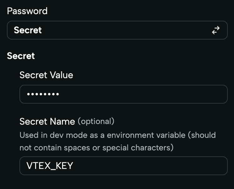
Secret. This type can be imported from
deco-cx/apps. Example:
Dynamic Options
This widget is especially useful when the options available in a field depend on dynamic data. It displays the same as the Select, but its options can be loaded dynamically via other prop or a loader! Example 1:MySection.tsx
MySection.tsx
mystore/loaders/produtos.ts
term, this will behave like a search.
Color Input
The Color Input widget displays a filled circle representing the selected color along with its corresponding hexadecimal value. Users can interact with the widget by clicking on it to open a color picker. Default value: “#000”.
MySection.tsx
Code
The Code Widget displays a code editor. UseCSS, TypeScript, or Json types. Example:
Button Group
The Button Group widget allows you to render select options in an icon format, providing a visually appealing way to choose options. Each option is represented by an icon, offering flexibility and customization for your application.
MySection.tsx
static/adminIcons.ts
file and exported as a constant:
mystore/static/adminIcons.ts
mystore/loaders/icons.ts
Icon Select
The Icon Select widget enables you to create a select input for icons, where each option consists of both an icon and its label. This allows users to preview and choose the right icon easily. All icons rendered in the widget must be defined explicitly as SVG strings.
MySection.tsx
static/sprites.svg file must be explicitly defined as an
SVG string and exported from a separate file, static/adminIcons.ts. We have
streamlined this process with the generate-icons.ts script on Deco’s
storefront template, which automates the conversion of icons from sprites.svg
into string format and writes them on adminIcons.ts.
To add new icons, simply insert them into your sprites.svg. Then, stop the
project’s execution and restart it using deno task run. This triggers the
generate-icons.ts script, updating the adminIcons.ts file with the new
icons, making them immediately available for selection in the widget. This
approach centralizes icon updates to sprites.svg, ensuring a smooth update
process.
Be aware that if an icon is not exported as a string on static/adminIcons.ts, it
will not be displayed as an option in the selector.
mystore/loaders/availableIcons.ts